What's the Difference?
🗺️ Anatomy of Experiment Results
Step 1: Once you've run some data into this experiment, you should see something like this picture: (don't strain your eyes, we get into the details below)
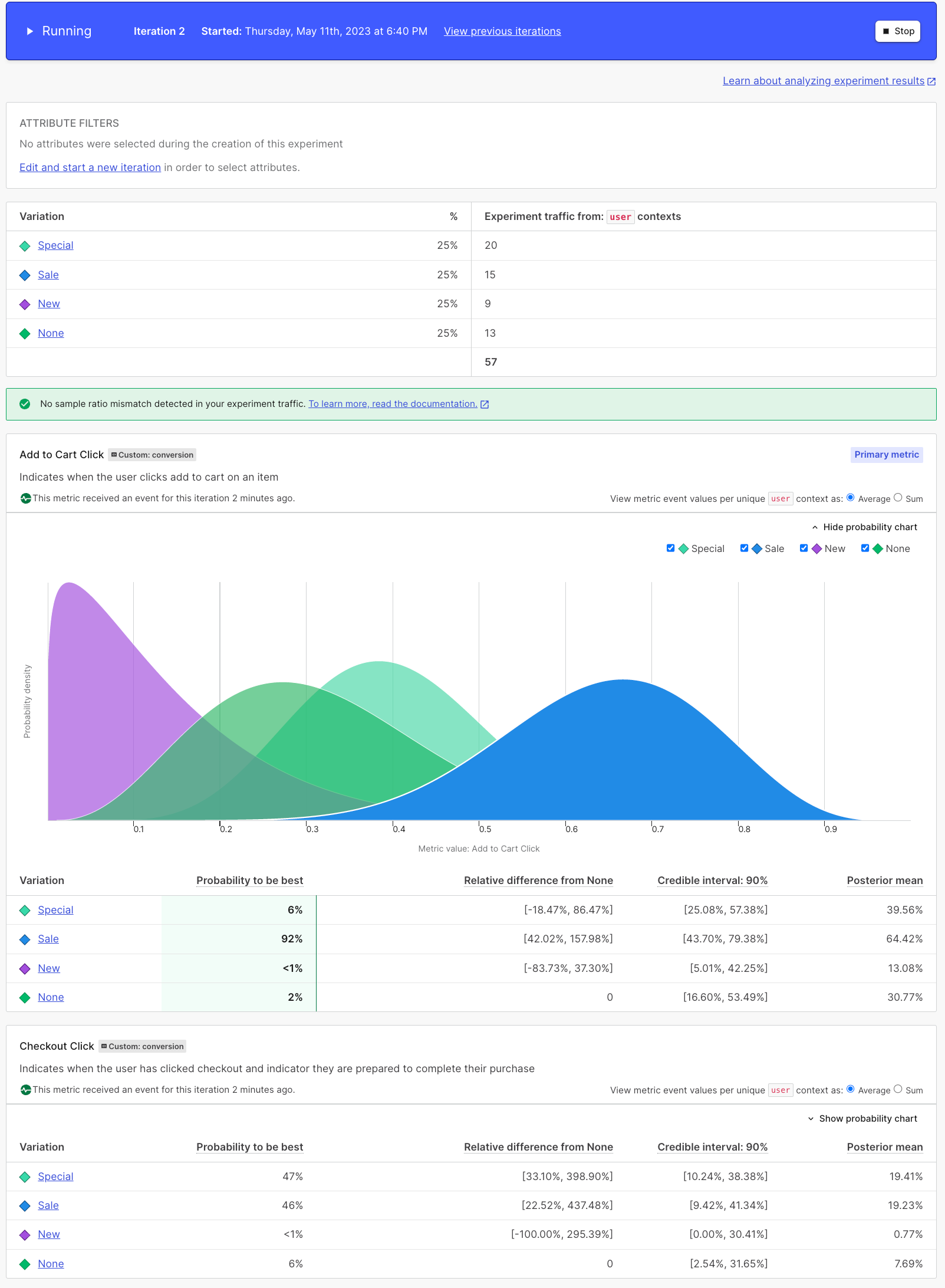
Something looks off...
Keep in mind, your results will look differently because they're randomly generated
That's a lot to take in, so let's break it down, piece by piece, no stats degree required.
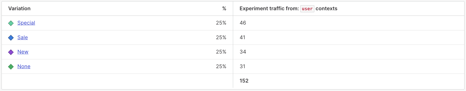
Step 2: Here we can see what kind of traffic we're taking in our experiment and how users are being divided up across our variations.
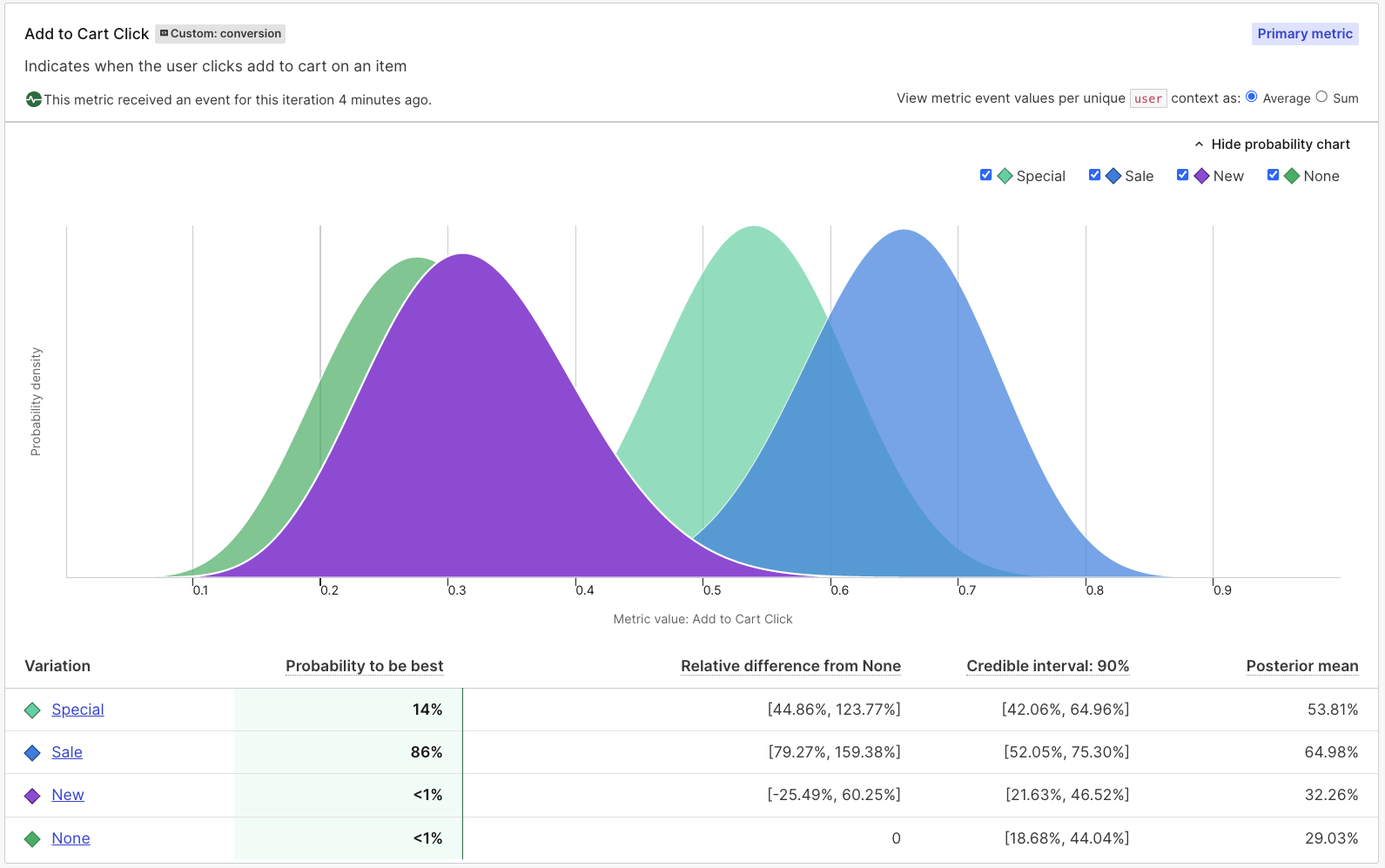
Step 3: Next, we get this beautiful colorful graph showing us how each variation did in the experiment. While a picture is worth a thousand words, understanding the data helps tell the story.
The Probability to be best column gives us a summary, based on the data LaunchDarkly has received so far and based on the variability in that data, LaunchDarkly determined that "Sale" is the stand out winner with an 86% probability to be best.
The Posterior mean column (recently re-labeled Conversion rate for conversion-type metrics like the ones we are using here) is really interesting too, because everyone wants to know not just who the winner was, but how each variation performed. That column shows us how well each variation performed.
We can see "Sale" had a 65% chance of clicking "Add to Cart" but that "Special" wasn't far behind.
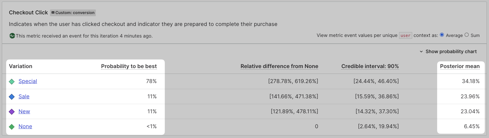
Step 4: Remember how we said we needed to keep an eye on "Checkout click" too, because we need to make those sales still? Let's dissect these results and see how our variations did there too.
You already know what Probability to be best and Posterior mean (Conversion rate) columns tell us, let's see which variations perform best by this dimension.
It looks like "Special" had the best chance of getting someone to click "Checkout" which might make it really tough to decide what to do if we didn't have that Posterior mean (Conversion rate) column!
Thanks to the Posterior mean (Conversion rate) column, we can see that every variation was better than our control or baseline when there was no accent label. "Special" really is the favorite there, but we can see that "Sale" and "New" both performed admirably as well so this change will help our bottom line.
Having this type of information makes it a lot easier to make informed decisions about changes to your application! It's a good thing you ended up taking that trip to Portugal or you might have been going off gut feel!